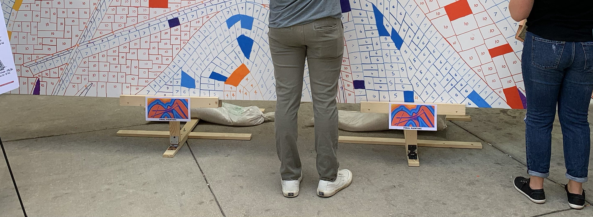
One of my first realizations after day one was the need to communicate clearer and quicker about the project. The first things I added were two small print-outs of what the final painting was going to look like. During the first day, I heard a few different people ask what it would look like when completed. I thought I would have been able to whip out my phone to show those curious, but printing out the art and taping to the bottom of the easels proved much easier to see.
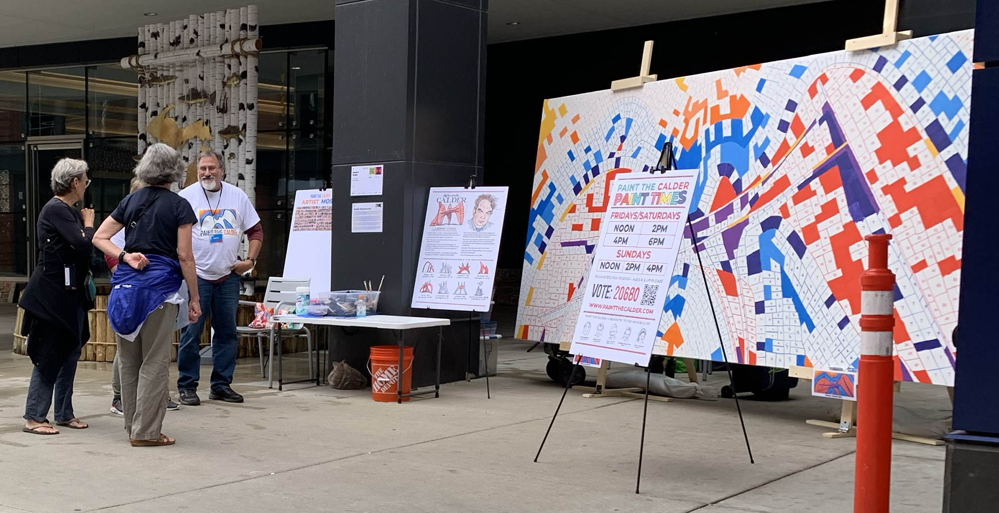
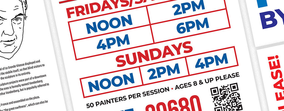
I’d long intended to have two 24″ x 36″ posters near the canvas that provided info about the paint times and about the sculptor Alexander Calder. I had designed these two posters on my computer (shown in their digital form below), but thought I’d challenge myself and execute them by hand on poster board. They ended up taking entirely too long to draw out and letter, but I used a digital projector to get the rough elements in the right place. I then used markers to add some color. The “descriptor” sign as I call it, intended to clearly state what the project was about, in the simplest of terms. “Paint The Calder – A 1,600 Person Paint-By-Number.” I added a couple of these 8.5″ x 11″ print-outs to the larger signs, so people could more quickly comprehend what we were doing. I also added the QR code signs so people didn’t have to search for where to vote.
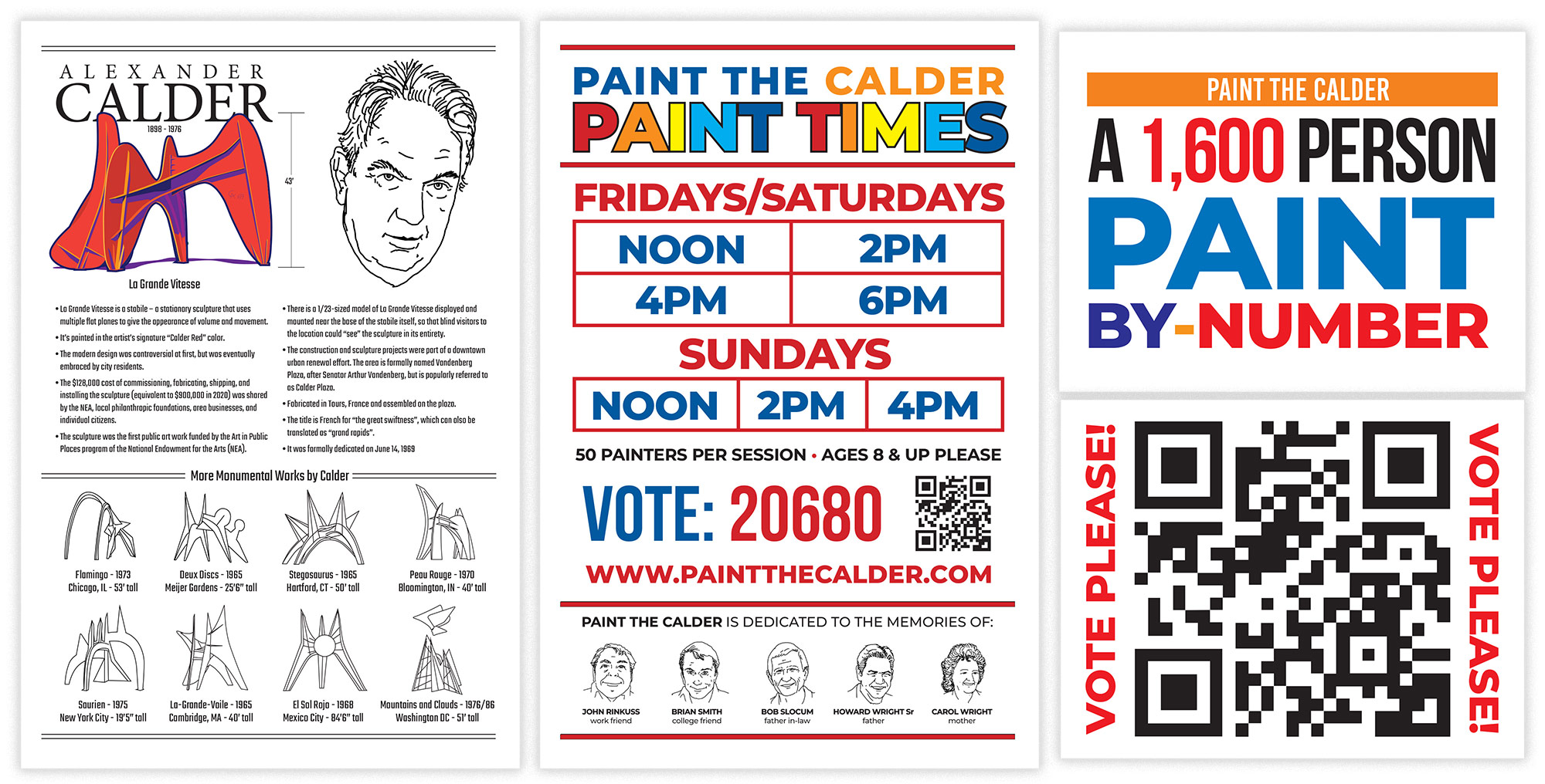
This view shows the two side posters referring to Alexander Calder and the paint times. In the back, you can see the start of the Artist Mosaic poster, which was intended to show people what I was creating by taking their photos. I ended up adding to this poster a couple of times over the first two weeks before having the final version up during the last week.