
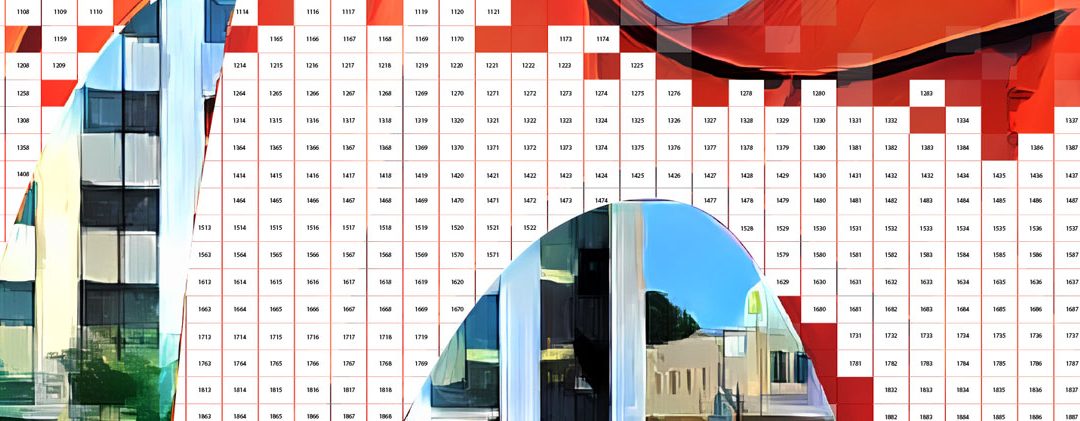
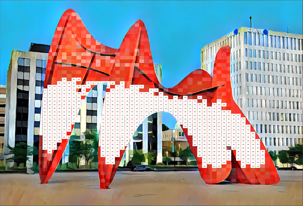
 I had been wrestling with two concepts for the paint-by-number: the Calder sculpture or a cityscape of Grand Rapids. The cityscape approach was an early favorite, as Grand Rapids is a beautiful city, with the river and iconic buildings. Turning such an image into a paint-by-number felt daunting though. Limiting the number of colors was the first challenge. Keeping shapes similar size was also hard to imagine. The Calder sculpture on the other hand is bold and iconic. I started to believe that it could be achievable, but wasn’t sure how to break it up into paintable shapes. I tried an initial idea of using a grid for the sculpture, but what to do with the other parts? The buildings around the Calder are rather ordinary. They don’t really add anything to the story of the sculpture or beauty and the grid approach felt a bit too pixel-like.
 I began to think that the painting would need a better background, with perhaps interesting sunlight and shadows. Including people around the base of the sculpture was an intriguing idea too. After visiting the sculpture one weekend with my art school friend Matt Hauch, I began a concept from the opposite side, showing the sculpture in the Calder Plaza with landscaping in the background. This had promise, but frankly was a bit dull. Adding people would have helped, but I abandoned this direction and felt like I needed to take a more creative approach. The bright colors and graphic look of this version was still interesting to me though.
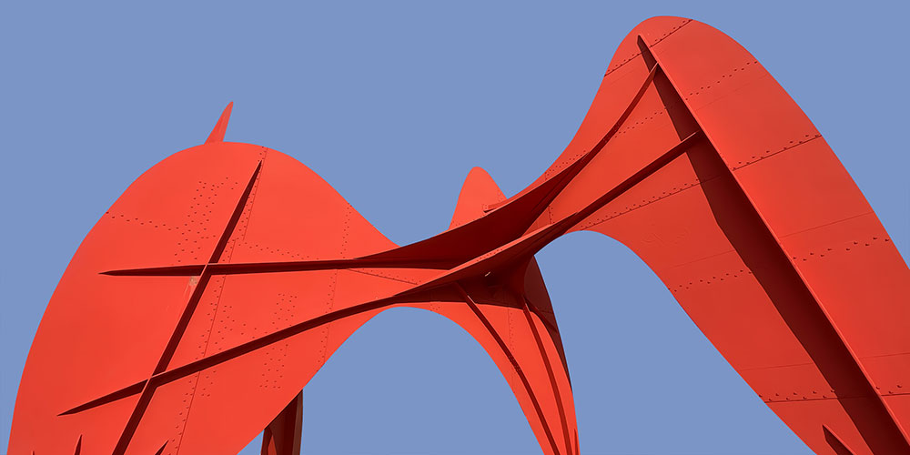 The sculpture itself is quite large so showing a more interesting angle could work. I decided to stop by the sculpture one morning and took several photos from a variety of angles. Looking up at the sculpture certainly was interesting. Plus, the sculpture has been used in a range of community iconography and promotions, so an ordinary view of the sculpture felt uninspired. Looking up, the abstract nature of the sculpture was accentuated. I still considered adding some people somehow but that idea didn’t really work due to the angle and scale. Embracing the graphic approach with flat vivid colors remained possible. There was also the issue of the background. I removed the background buildings from the photo and replaced them with a blue field. Adding a dramatic sky behind the sculpture might add something too. I tried a few different types of skies, but they either felt distracting or didn’t really add anything. I felt like I had the core of the painting in place, but needed to work out the rest.
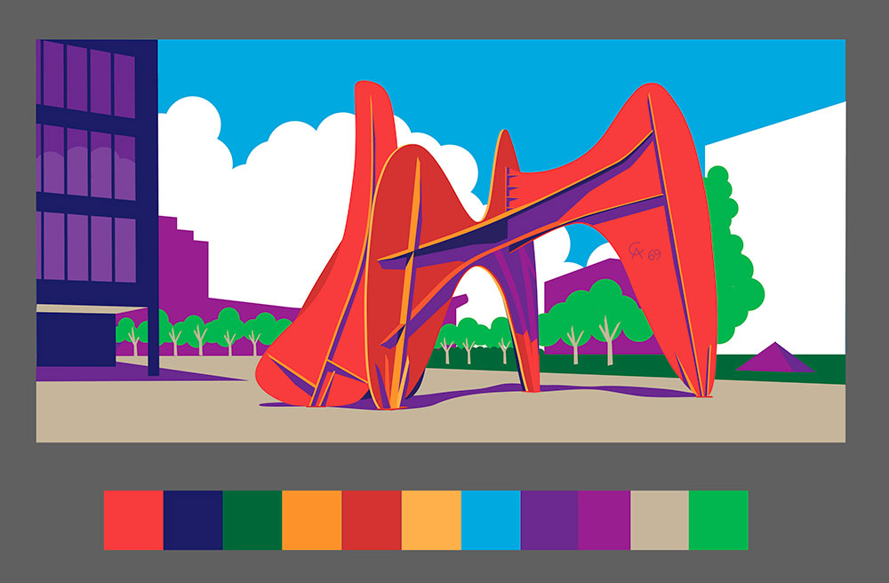
 Finally, I just decided to jump in and redraw the sculpture in Adobe Illustrator and play around with the colors. I leaned into the graphic feel even more, adding a heavier outline and working with a limited palette. It started to feel like a piece of pop art but I still had the matter of the background to address. White clouds weren’t working. The plain blue sky was too boring. I then added some bands of blue around the outside to really accentuate the shape. It started to look interesting and unique. I thought I had it figured out, but kept playing with the colors.
 Changing the bands to include warmer colors seemed to add some additional spunk to the image. The oranges seemed to feel like an abstract sunset and it just felt more complete. The palette remained limited with only eight or nine colors, but it didn’t lack in interest or vibrance. I shared the idea with a couple friends and family and got their thumbs up! While a more “painterly” approach might have been more in line with a paint-by-number, my career as a commercial artist made the graphic approach feel more authentic and original. Hopefully others find it as interesting when it’s a 6′ tall by 12′ wide painting!