

When I started working with computers, specifically early Macs, back in the late 80’s, black and white screens were the norm. I still remember the thrill when our department purchased its first color Sony Trinitron monitor at the company I worked for out of college. Crude by today’s standards, it still beat the heck out of the black and gray shading we stared at all day while working in desktop publishing software such as Adobe Pagemaker and MacDraw II.
Fast forward nearly 35 years and we’ve all gotten used to HD displays and televisions. My Macbook Pro screen even touts itself as “retina” resolution. One thing really hasn’t changed all that much and it’s how on-screen colors don’t really translate to printing. That florescent green that looks so bright on your computer screen can’t really be produced with a desktop printer. A big reason is that the screen is basically a big colored light source, making colors (specifically RGB colors) as bold and bright as possible.
 After creating the concept image for my painting, I fell in love with the brilliant red orange and other colors it included. I even made it into a wallpaper image for my iPhone and laptop. When I began thinking about paint for the painting, the thought struck me that I might struggle to find paint that would be as bright and strong as the colors that appeared on my computer screen. Not only that, but if I looked for bottled acrylic paints found at an art supply store, I may have to mix them to get the colors I wanted, or settle to their version of orange. Mixing can be a risky process and provide unexpected results. Not the kind of chance I wanted to take with a limited budget and lots of colors to come up with.
An associate suggested using house paint from a home improvement store. At least the swatches would allow me to find something close to what I wanted and it would be cheaper in volume versus artist’s paints. Plus, purchasing paint at a later date to match could be done through using the swatch. No mixing myself or guessing.
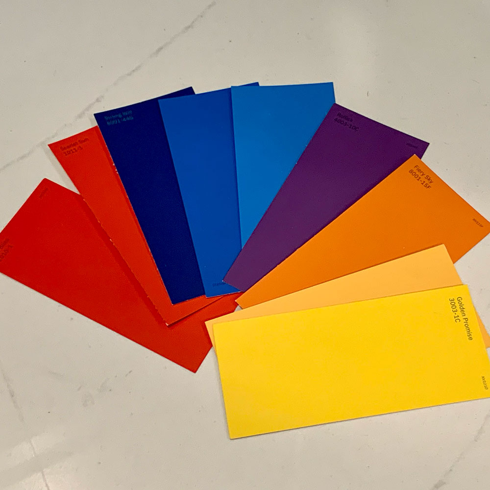
As I entered my local home improvement store recently, I headed to the paint department to scan the selection of swatches. My eyes immediately caught the family of bold Valspar colors. Just about every color of my palette was available! The red and red orange were incredibly similar to the colors on screen. The blues and purples weren’t as close, but still within the realm.
This realization really made me excited for the possibilities of seeing them used in the large painting. As a bonus, the paints can be sold in sample jars, which may work perfectly for the colors that need less coverage. Now all that’s needed is to determine what quantities I need, which may be possible once I add up the numbered spots for each color on the canvas.